
INTERNAL COMMUNICATION
VISUAL SYSTEM.

The Challenge
Develop a unified visual system that could strengthen KACST's internal communication while remaining authentic to the organization's identity across multiple initiatives, campaigns, and digital platforms.
Creative Concept
One Identity.
Multiple Experiences.
Instead of creating a new visual language for every campaign, the project focused on extending KACST's existing identity into a flexible design system capable of supporting internal communication, employee initiatives, social content, seasonal campaigns, and sports events while maintaining a consistent brand experience.
Visual Direction
From symbol
to system.
The visual language was derived directly from KACST's brand symbol. Its geometric forms were transformed into dynamic graphic elements that could continuously evolve while preserving a recognizable visual identity across every communication touchpoint.

01
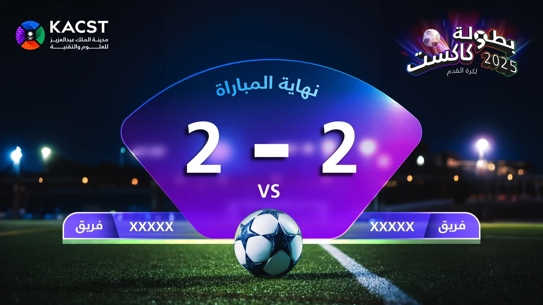
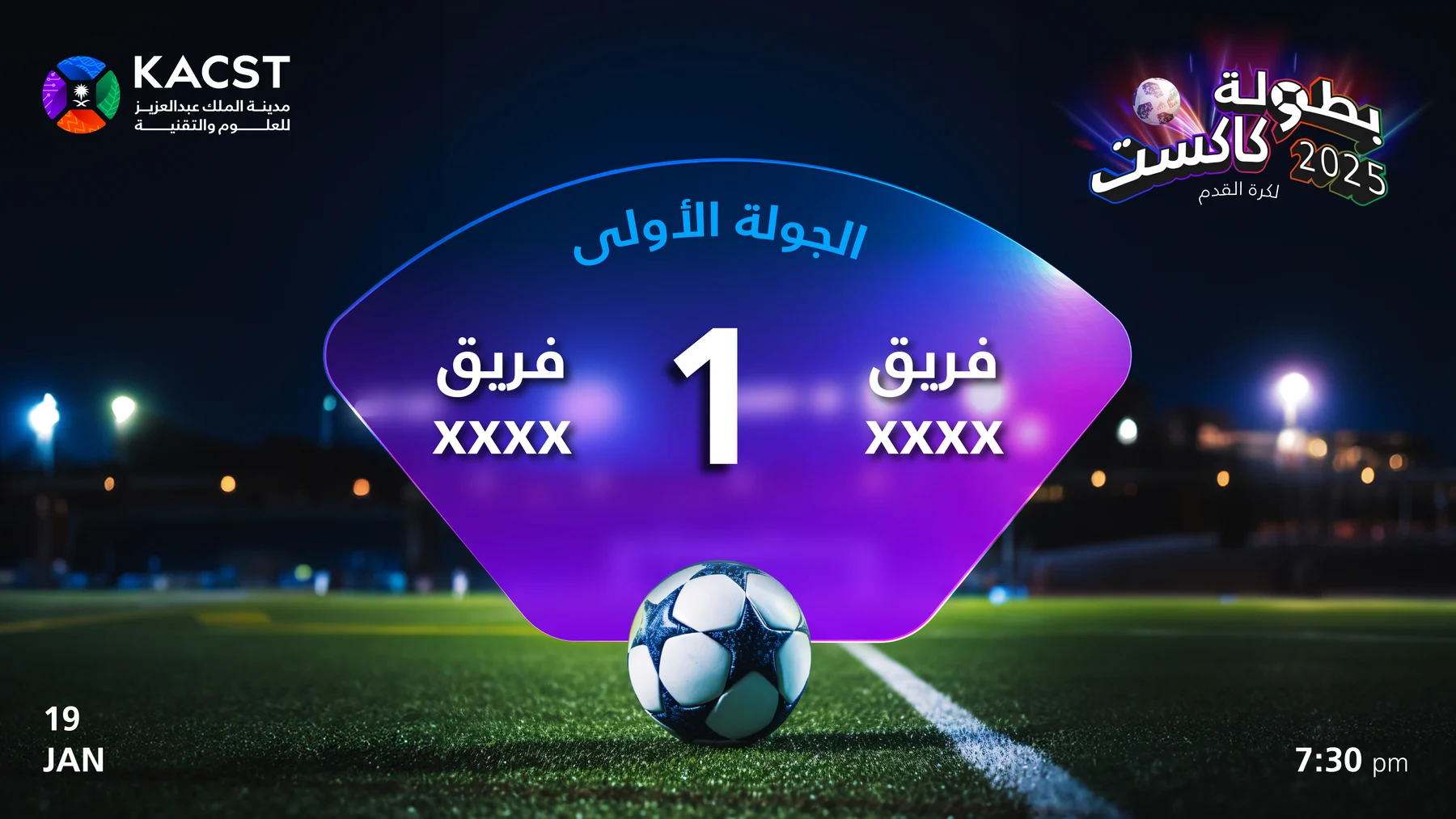
Sports Identity
Logo Philosophy
A custom Arabic wordmark was designed with a bold sports character, following the signature curved structure of the KACST identity to establish an immediate visual connection with the brand. The KACST symbol was seamlessly integrated into the letter "و", creating a distinctive identity that is uniquely tied to the organization and cannot exist independently from its brand.



02
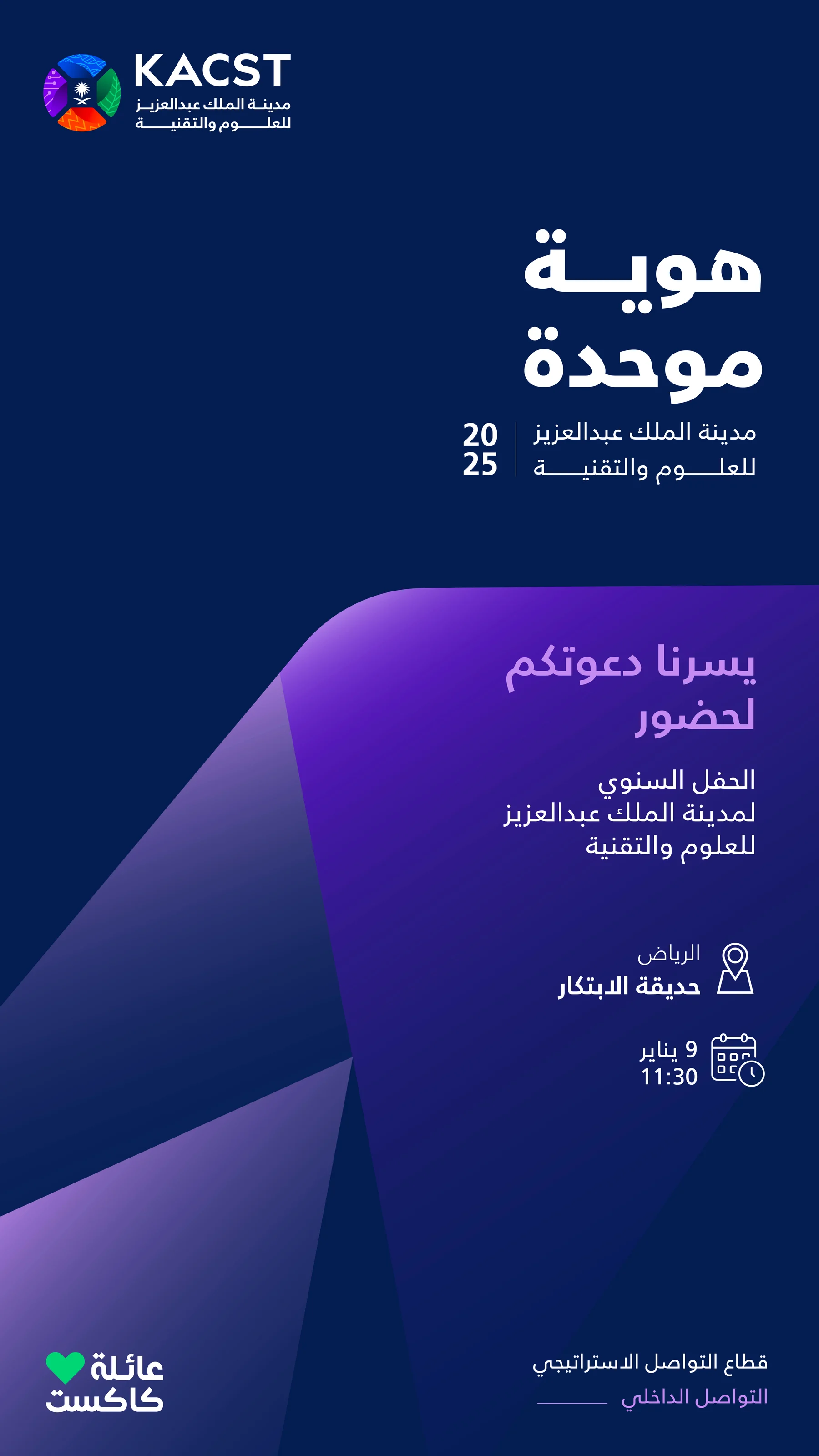
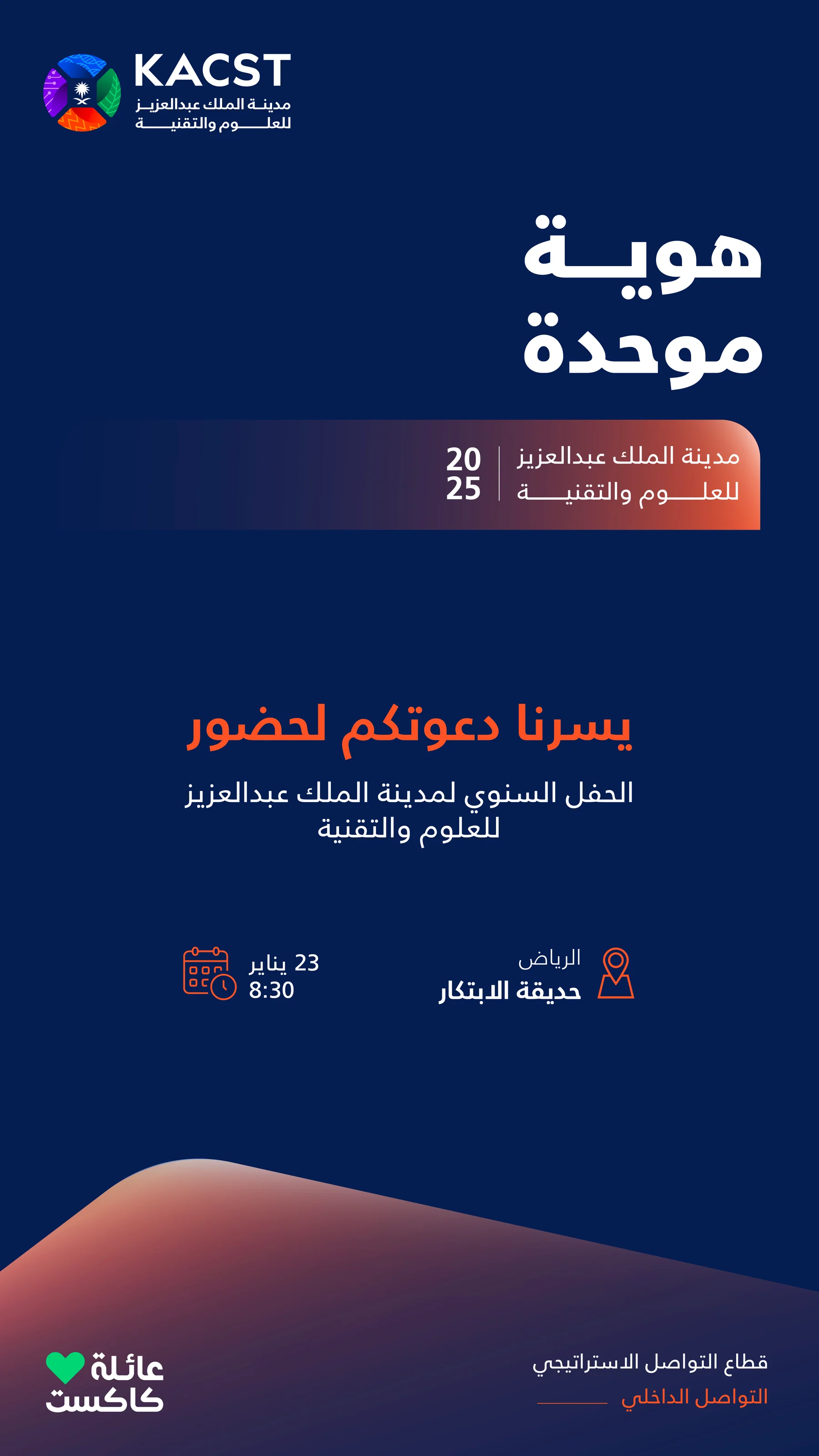
Internal Directions
Visual Concept
Every visual component was extracted from KACST's brand symbol and developed into a flexible graphic system. Rather than introducing unrelated decorative elements, the identity evolved into a scalable visual language that could adapt across campaigns, digital platforms, internal communication, and event branding while remaining unmistakably KACST.
Directions
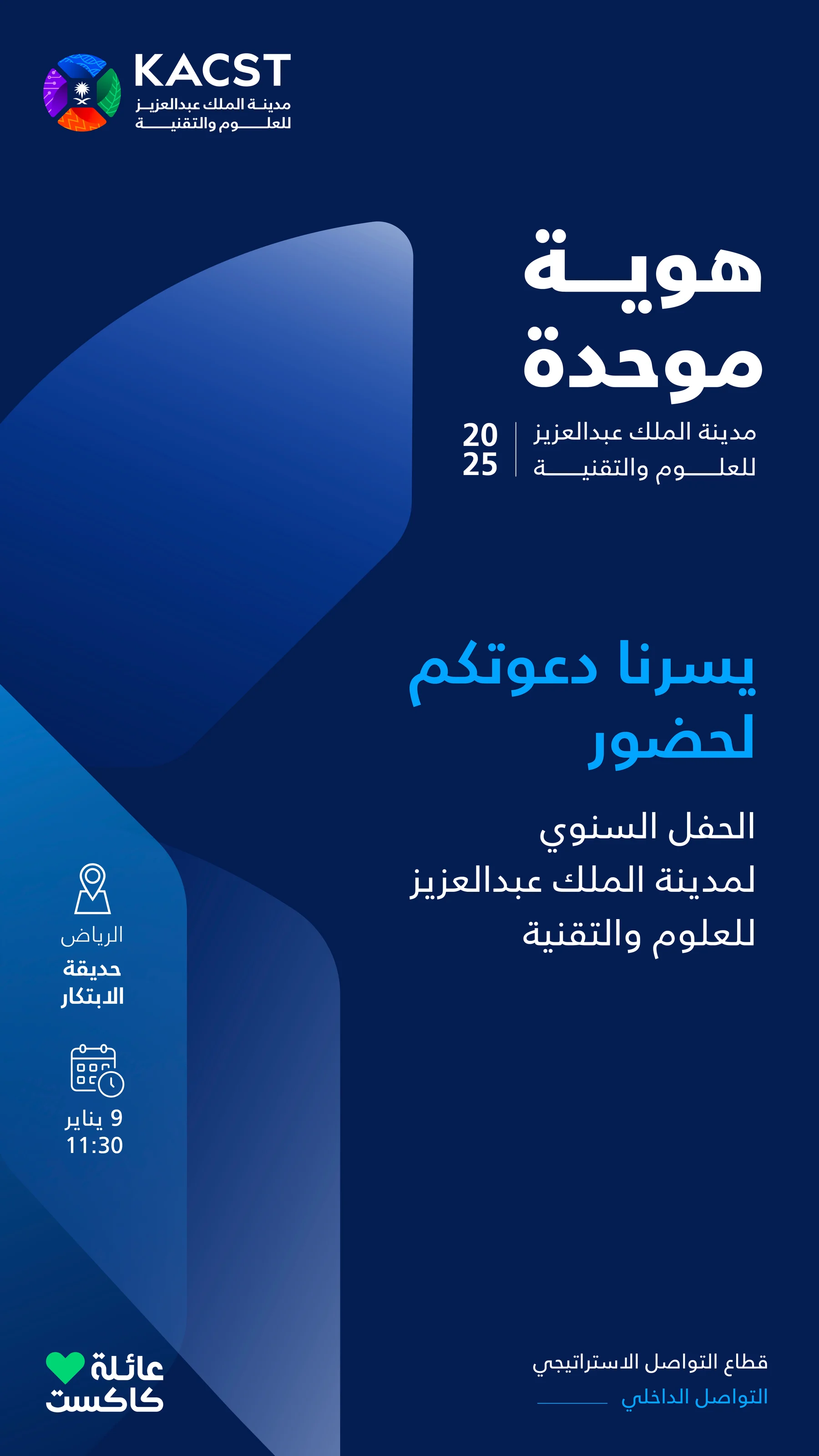
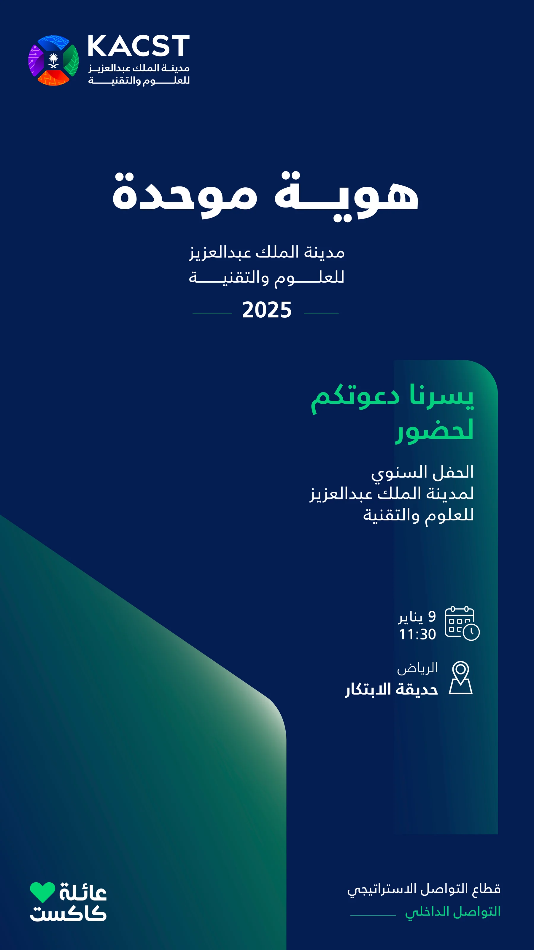
Final Designs
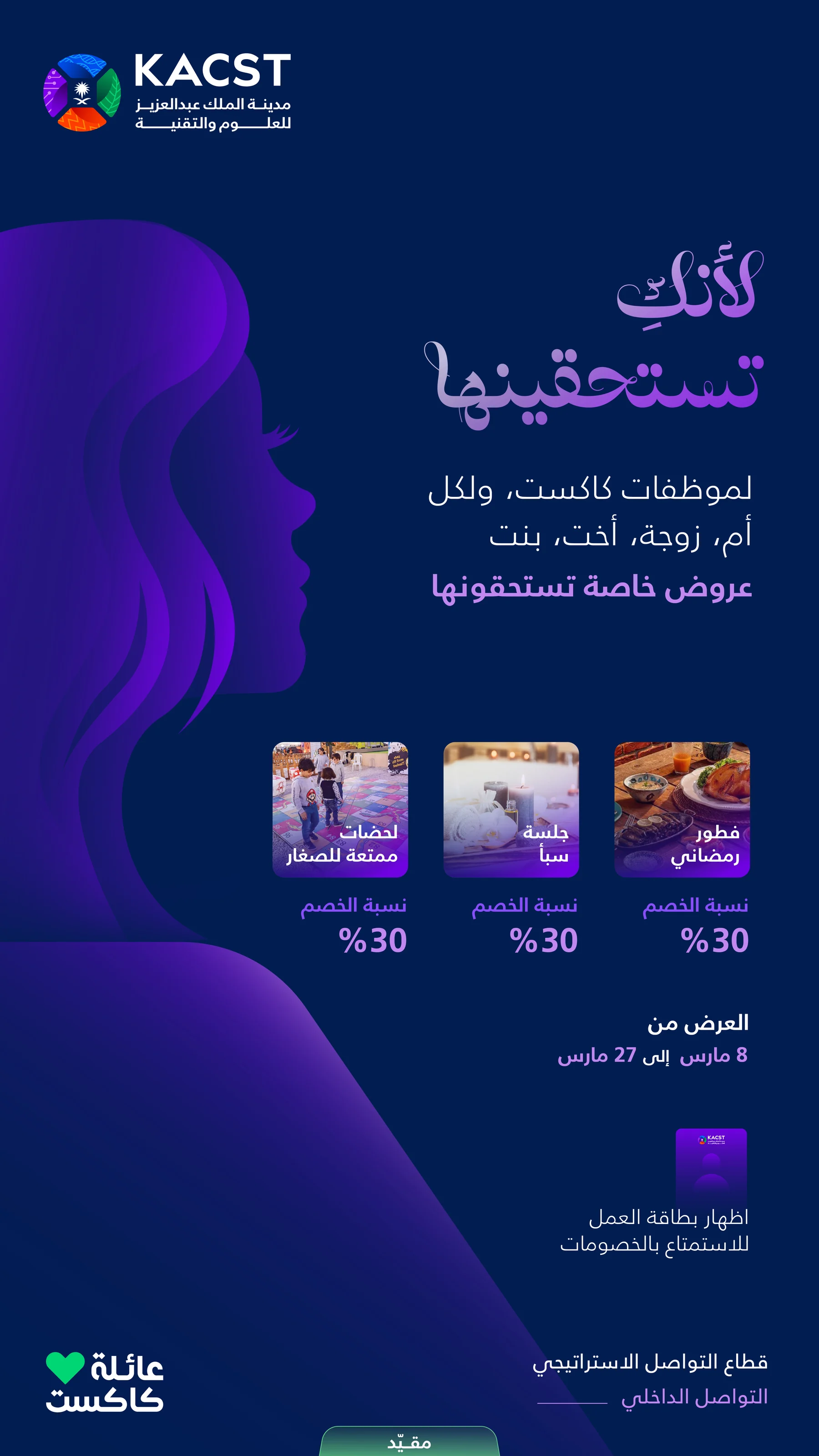
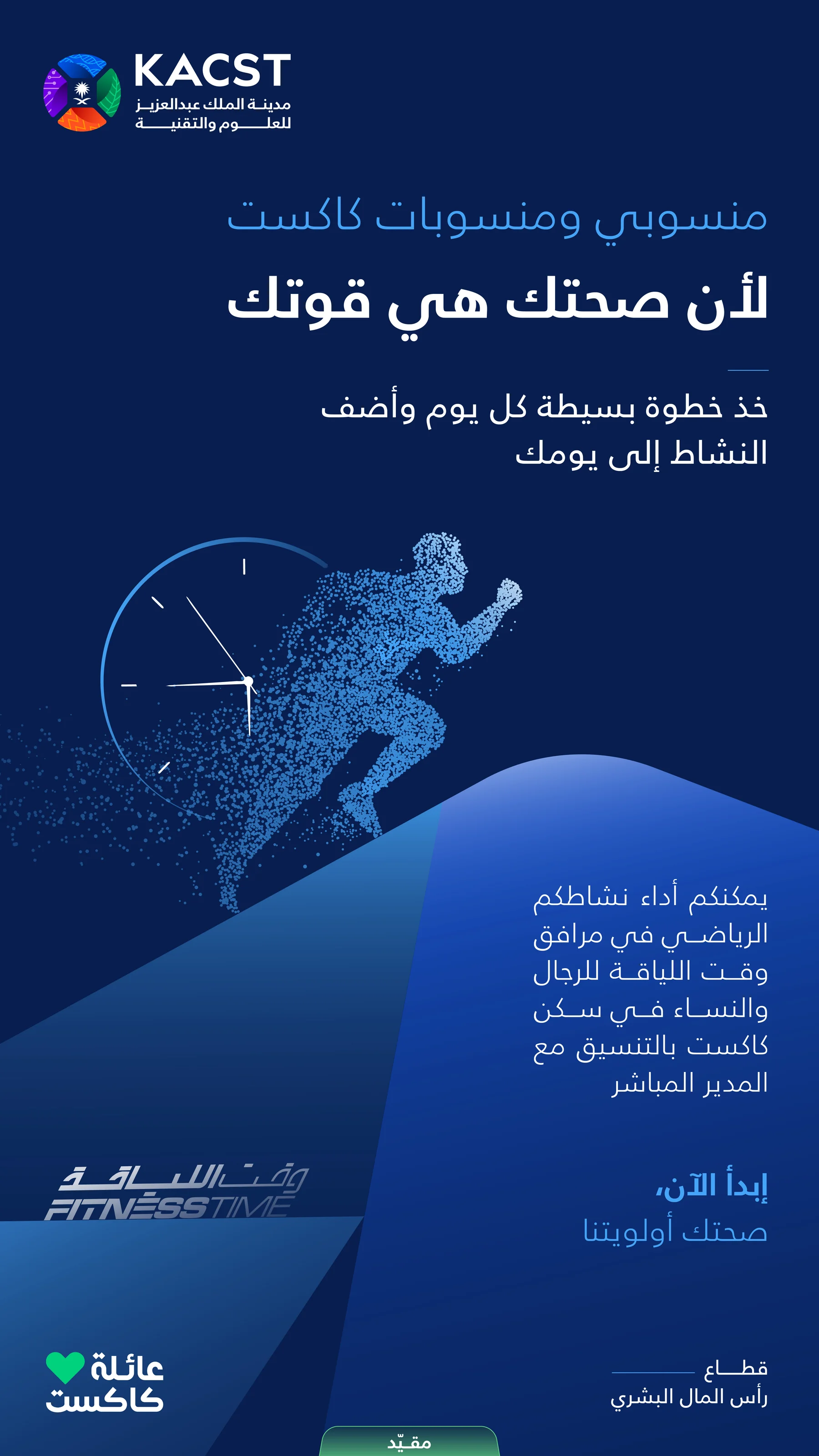
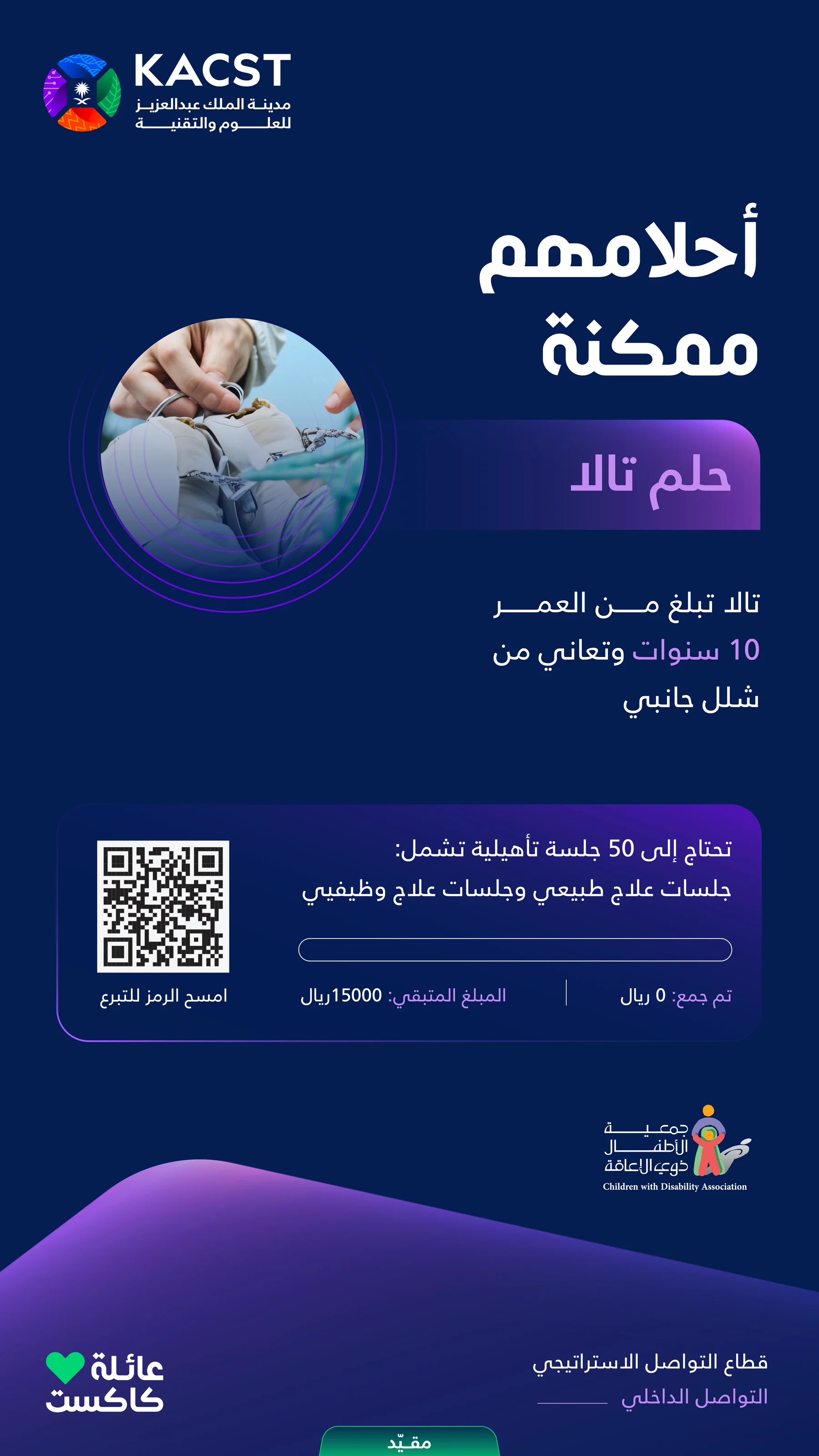

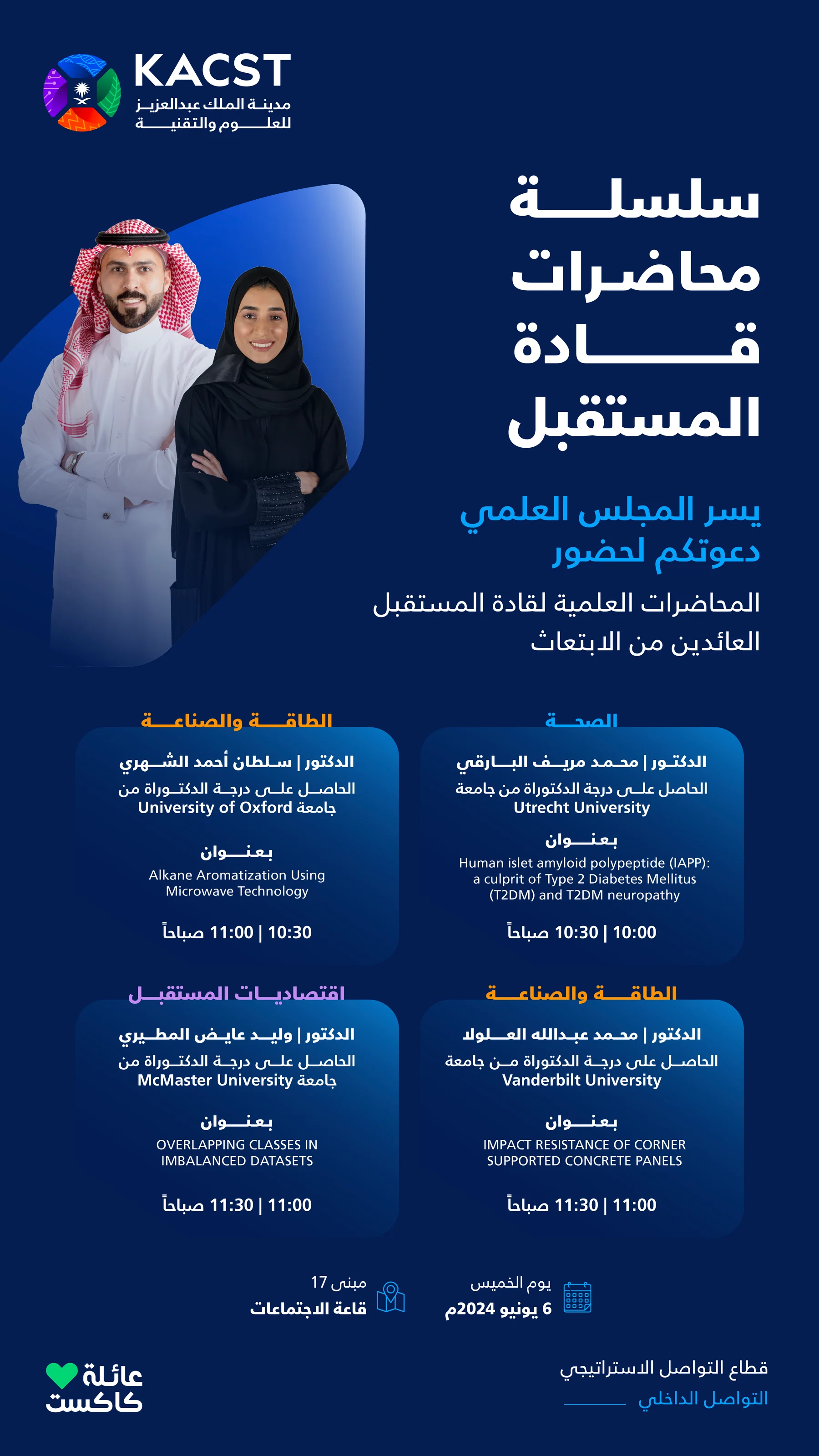
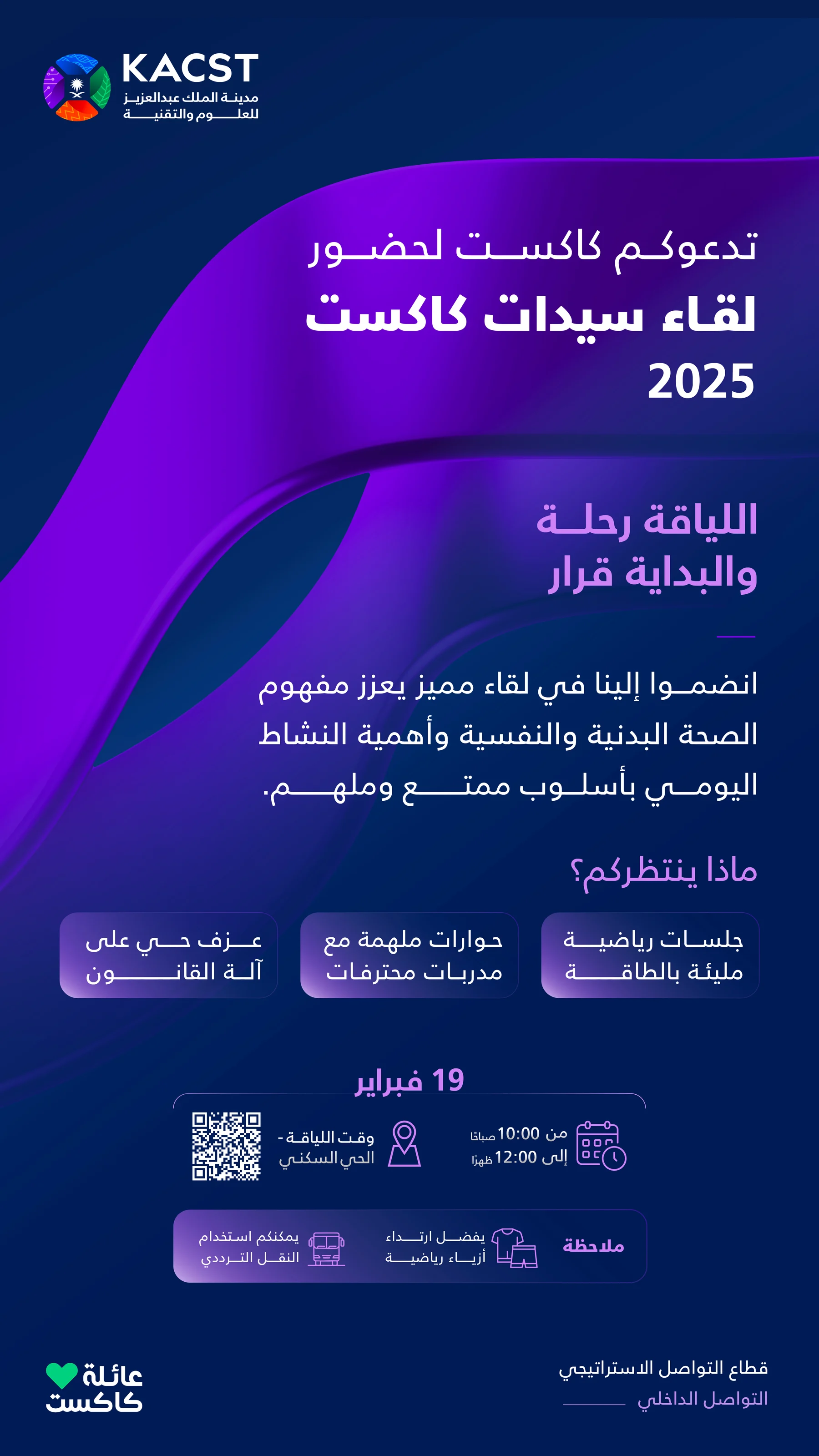
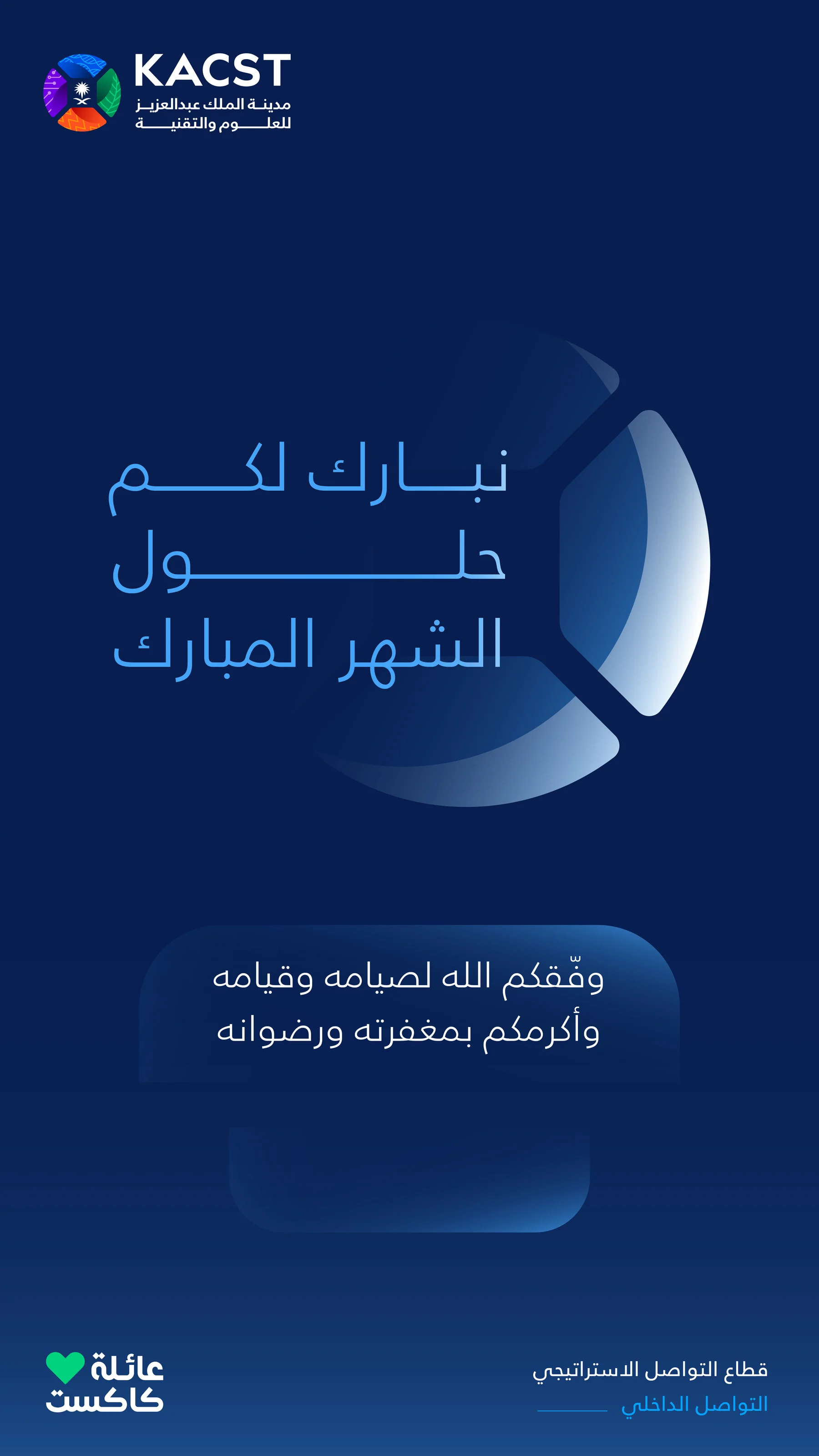
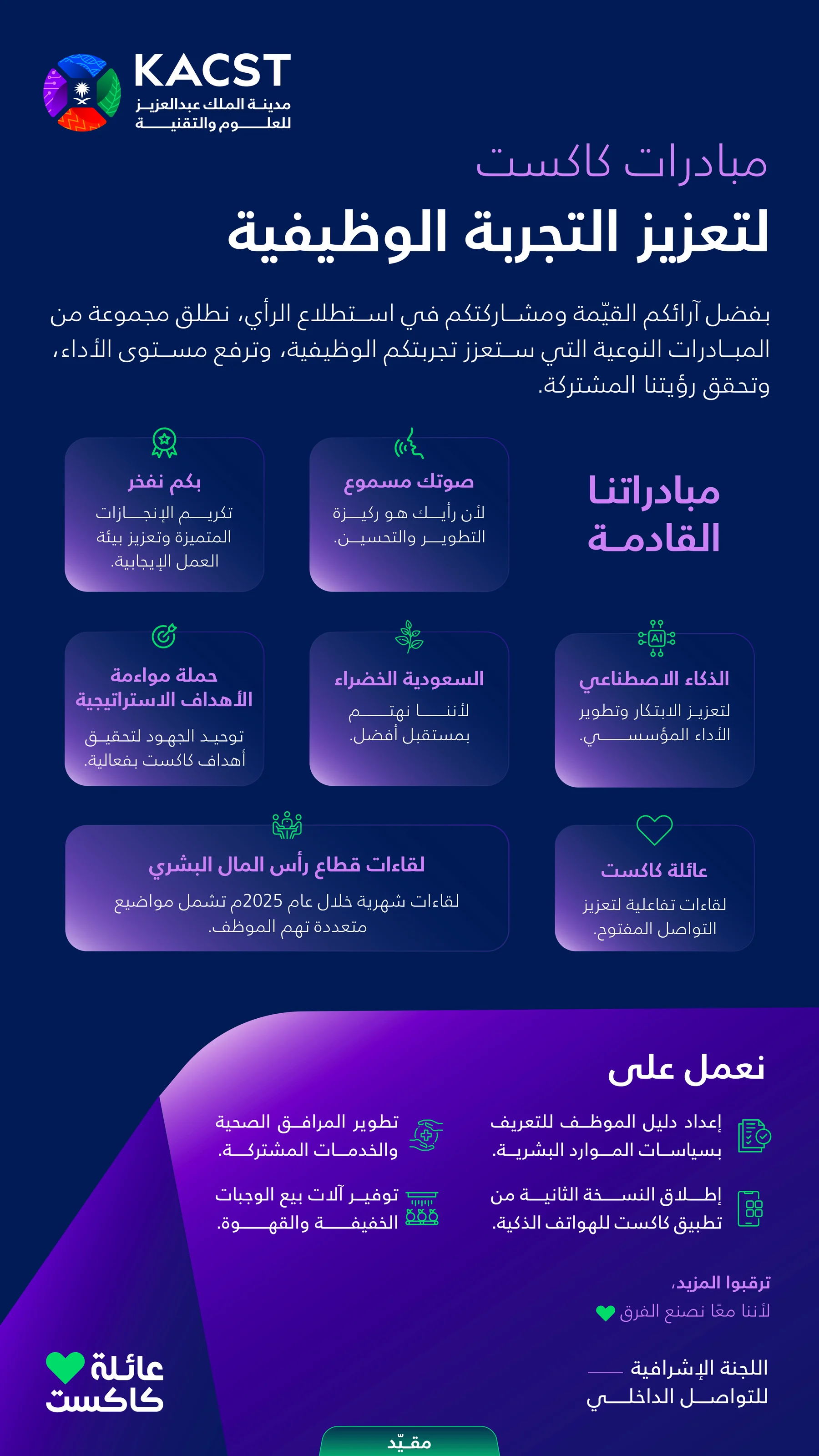
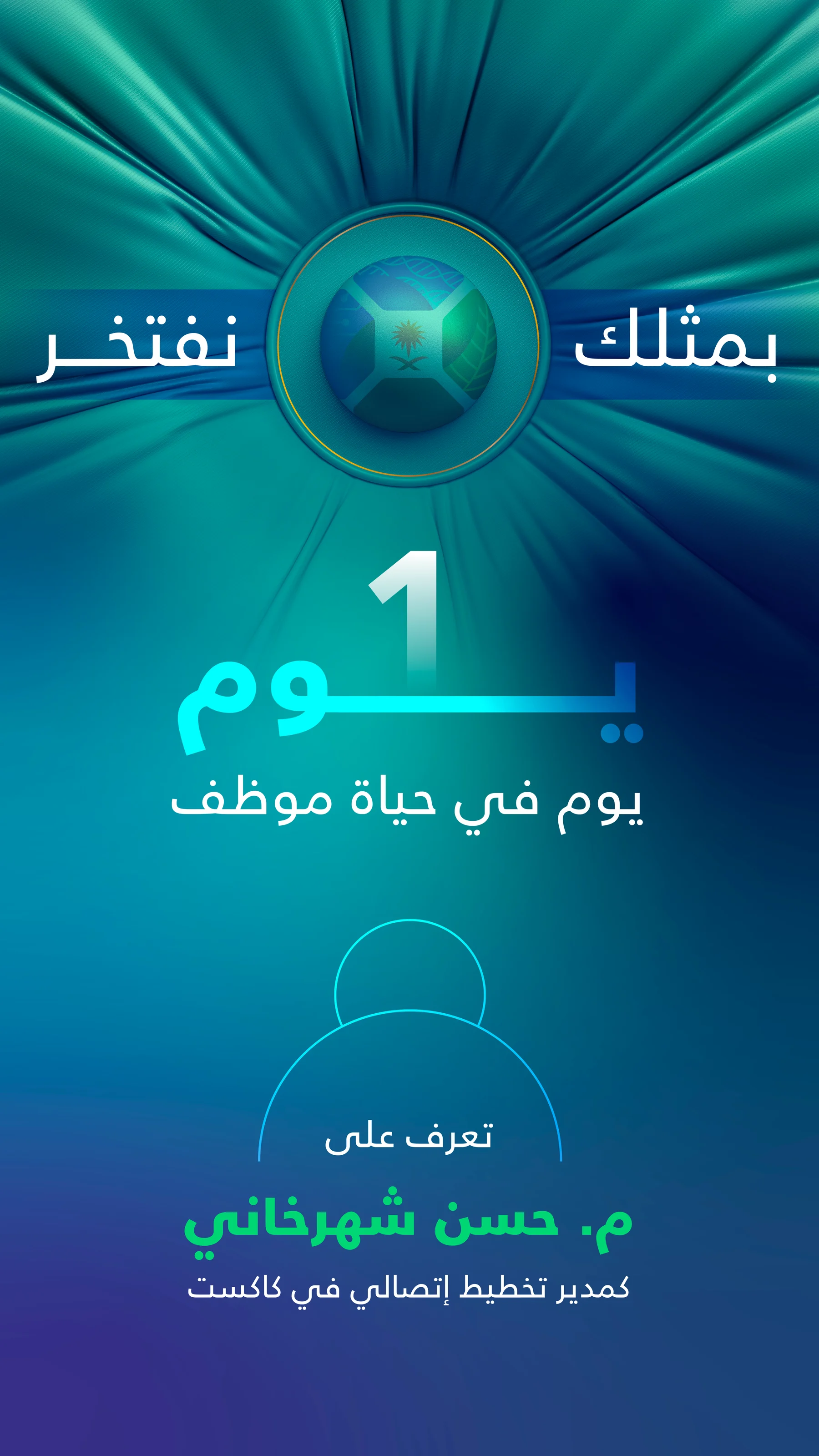
Snapchat
Designed for
the platform.
Snapchat content was built around the platform's fast-paced behavior. Instead of adapting static layouts, a dedicated visual direction was created using immersive scenes, bold visual hooks, and simplified storytelling. Every story delivers one clear message while maintaining a consistent connection to the KACST identity.




My Contribution
Explore the portfolio